
The final assignement of the course was to create a poster and GIF to advertise AACC’s annual Global Giving Market. This was an interesting project, because I wanted to create designs that had a lot of movement and organic shapes, since I usually tend towards that style. However, it is difficult to maintain the desired hierarchy of scale and make sure the information is all readable in these formats. I wanted to find a way to make this work, so I experimented with a variety of curvilinear layouts, using plants, water, and other abstract shapes.

Going through the SRRV website was very interesting. I also found some old student projects from googling “global giving market AACC,” which was cool to see! My thumbnails are really centered on tying in a “natural” element and a “global” element. I think the first two are pretty strong, but I also like the fourth one. I think the weakest is the fifth (center bottom row). I wanted to try to create something more vertical, but I thnkn it just splits up the space in a weird way. The third was supposed to be more focused on textures, but I think the lack of a central object makes it weaker as well. Overall, I think I will probably combine elements from the designs I like; I’m really drawn to the idea of having some of the text as individual leaves, and I like the idea of plants growing out of the Earth. At this point, I planned to execute these designs through a combination of vector graphics and public domain images.
I chose to expand on the first two designs I created. I decided on two fonts, a more abstract one for the larger words, and a neat typewriter font for the details. I went with a purple/yellow color scheme because I thought it provided a lot of contrast and visual interest. I really just wanted to get the basic layout/color scheme of each down before investing more time into either one. I think the first one is more of the direction I will go in, but I want to add more smaller flowers, and find a way to take advantage of the circular frame that the larger flower provides.
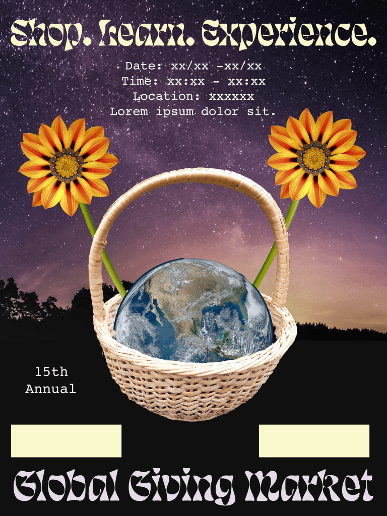
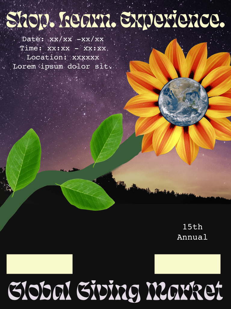
In the final composition, I introduced a lot more details. I included examples of the kinds of goods that might be sold at the market, and added more flowers to frame these items. I also added a lot more structure to the layout of the poster by color blocking out areas for the text. I added drop shadows to the flowers and some of these text blocks to create more depth in the composition. In addition, I added some hand drawn details (made in Procreate, which can export directly to .psd) to complement the idea of the handmade goods being sold at the market. I added an adjustment layer to fade out the color and give the poster a vintage kind of feeling. I excluded the Earth from this fade (and gave the planet a halo), to make it stand out as the center of the composition.

- I think my visual hierarchy is successful. The viewers eye is first drawn to the large text at the top and bottom, then the smaller typewriter text explaining the date and location, and finally the smallest text with the details of the event and contact information.
- The artwork and the information work together to create two interlocking triangular shapes. The colors of the text and the artwork are also complementary. The artwork also incorporates examples of the kinds of goods that might be available at the craft fair, while emphasizing the idea of global free trade and growth.
I had a lot of trouble deciding how to accomplish the multimedia section of this project. The timeline tool in Photoshop is probably still the thing I am the least confident in using. I tried to find a way to make my limited knowledge of techniques still look dynamic and complement the design of the poster. I carried the font choices and some of the stock photos through to the GIF, and retained the concept of flowers blooming and the Earth from space. After making sure the text stayed long enough to be readable at each stage, I finished by adding an adjustment layer to mirror the values of that I used in the poster.

Leave a Reply